Making credibility understandable in search
Seekr
Search UX · Information architecture · Interaction design
People can search quickly and still struggle to understand why a source deserves their attention. My work on Seekr focused on making credibility signals and political-leaning filters understandable within a familiar search experience.
Make credibility
understandable.
People can search quickly and still struggle to understand why a source deserves their attention. My work on Seekr focused on making credibility signals and political-leaning filters understandable within a familiar search experience.
The design problem was translating a complex evaluation model into useful decisions: what does a score mean, what will a filter change, and how can a person compare results without losing the flow of their search?
The design problem was translating a complex evaluation model into useful decisions: what does a score mean, what will a filter change, and how can a person compare results without losing the flow of their search?
Platforms
Web
My Role
Product Designer
I shaped the UX architecture, result hierarchy, filtering interactions, and data flows, working with the client and team to connect the underlying product model to a clear user experience.
Research & Design Direction
Survey feedback, competitive review, and prototype testing helped frame the experience around comprehension rather than the volume of information displayed.
Search conventions: compared familiar result patterns across Google, DuckDuckGo, and Bing.
Credibility signals: explored how people interpreted scores and supporting explanations.
Filtering: tested whether users could predict what a control would do and understand the resulting set.
These questions guided the information hierarchy and the move toward explicit, labeled controls.
The Challenge
Adding more information to search results can create more confusion. Credibility scores needed explanation, and political-leaning controls needed to communicate their effect before a user applied them.
The goal was to expose useful context while preserving the speed and familiarity of search. I focused on readable result cues, predictable filters, and clear relationships between a control and the results it produced.

Key Design Decisions
Make scores interpretable. Detailed numeric information was difficult to scan. I explored visual cues supported by plain-language explanations so users could understand the signal in context.
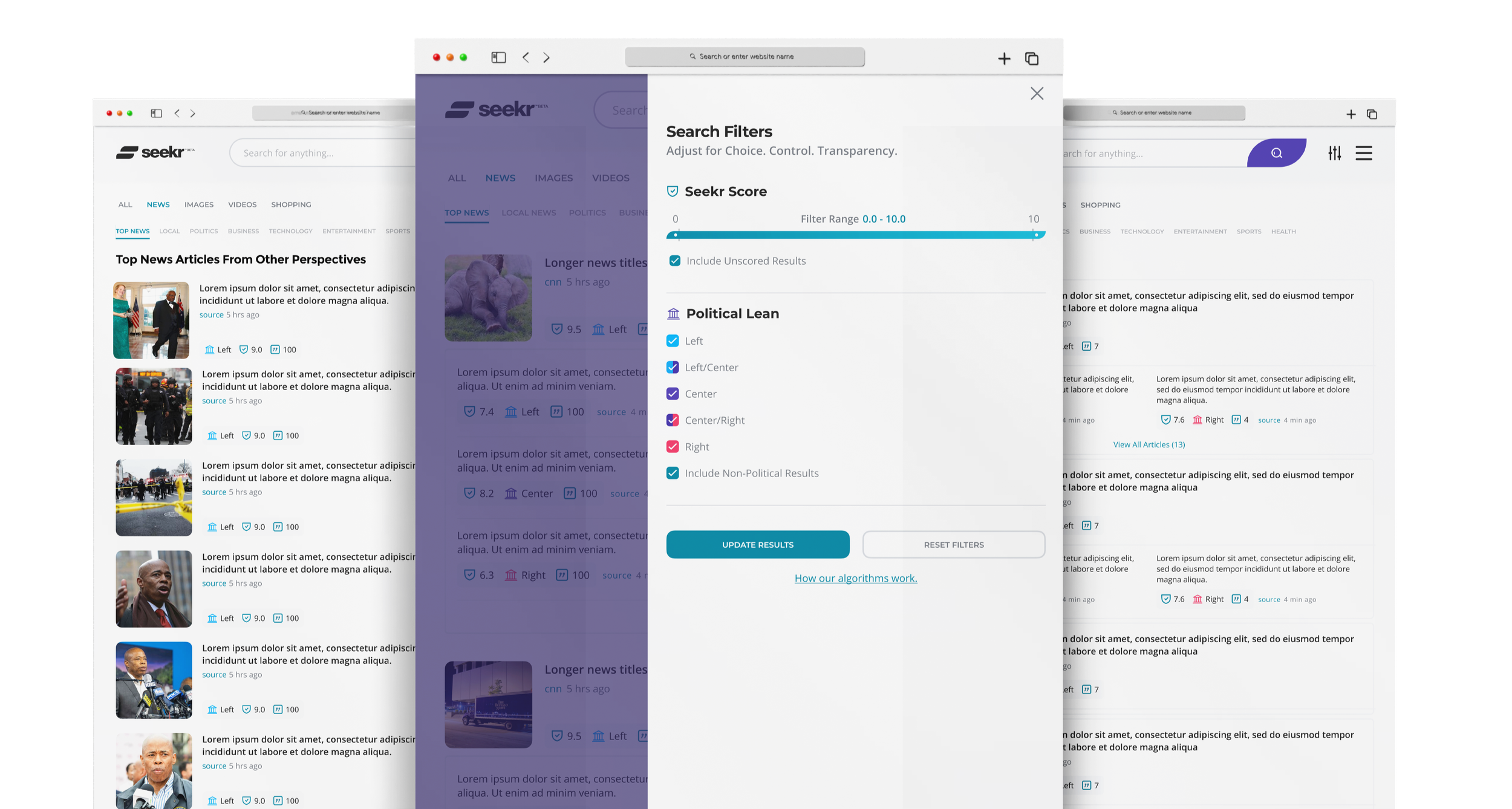
Make filters predictable. Replaced an ambiguous slider direction with discrete, labeled categories that made the selected range easier to understand.
Keep the search task primary. Result context and additional controls needed to support comparison without overwhelming the page or obscuring the next action.
Redesigning the Filtering Model
1. Identify the mismatch
The original slider represented political leaning as a continuous range. That looked compact, but users had difficulty predicting which results their selection would include. Content volume also varied across the range, making the interaction harder to interpret.
I reframed the problem around the user’s intent: selecting a clearly understood perspective rather than manipulating an abstract distribution.

Original Filtering Sketch

Original Filter Design
2. Make the choice explicit
I proposed five labeled categories: Left, Left/Center, Center, Center/Right, and Right. These replaced the ambiguous slider. Each option communicated a defined selection, making the relationship between the control and the results easier to follow.
3. Extend the model thoughtfully
Competitive research informed a proposed Historical Searches module that explored how a topic’s distribution changed over time. This added context to the filtering model while keeping the core search controls direct and understandable.

Competitive Research for New Filter Options
4. Connect the interaction to the page
I developed the direction from wireframes into high-fidelity proposals, refining labels, selection states, and the placement of controls alongside results. The proposed experience made the selected perspective visible and gave additional context a clear place in the search journey.

Proposed Wireframes for New Filters

New Filter Proposal - High Fidelity

New Proposed Filter Application
Design Outcome
The design direction connected readable credibility cues, explicit filtering categories, and contextual exploration in a single search experience.
The work shown here documents the proposed filtering model and its progression from early sketches to high-fidelity application. Its value is the clearer relationship between user intent, control behavior, and result context.
What This Work Demonstrates
Transparency depends on more than displaying a score. People need to understand what a signal means, how a control changes the experience, and what they can do next.
This project demonstrates my approach to complex product models: identify the comprehension gap, simplify the interaction, and carry the decision through the information architecture and visual design.