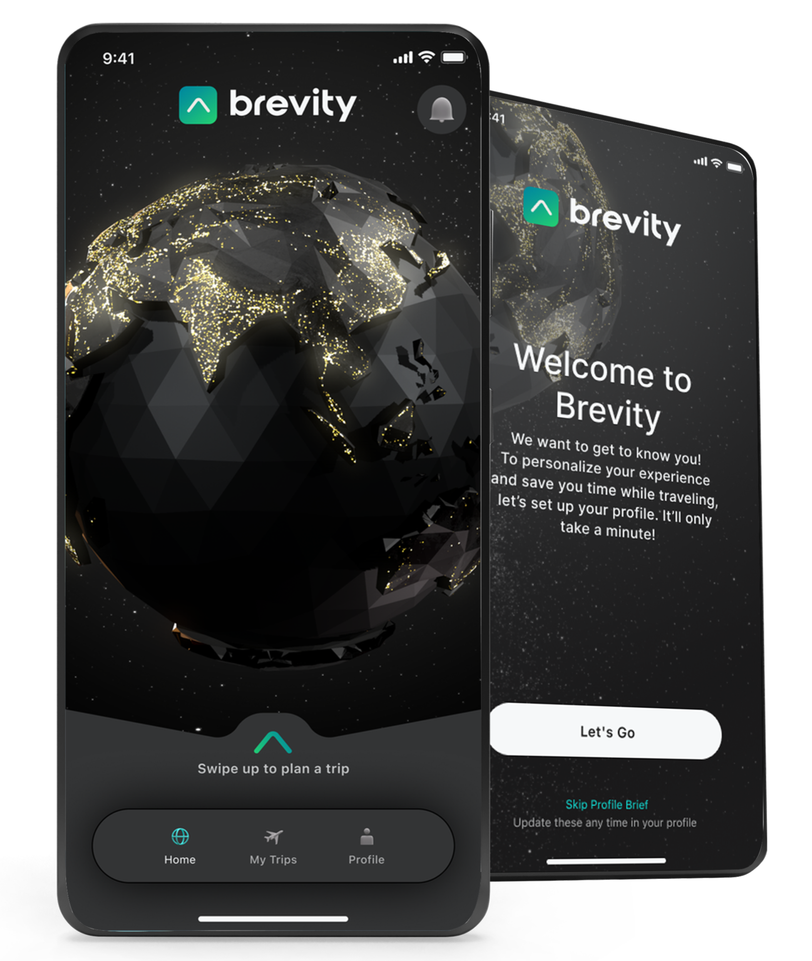
Connecting travel inspiration to a confident booking
Brevity
Mobile product design · Travel planning · UX architecture
Travelers planning a high-end trip often move between recommendations, booking sites, and concierge conversations. I worked on a mobile experience that brought discovery, preferences, and planning into a more connected journey.
Curated travel.
Confident choices.
Travelers planning a high-end trip often move between recommendations, booking sites, and concierge conversations. I worked on a mobile experience that brought discovery, preferences, and planning into a more connected journey.
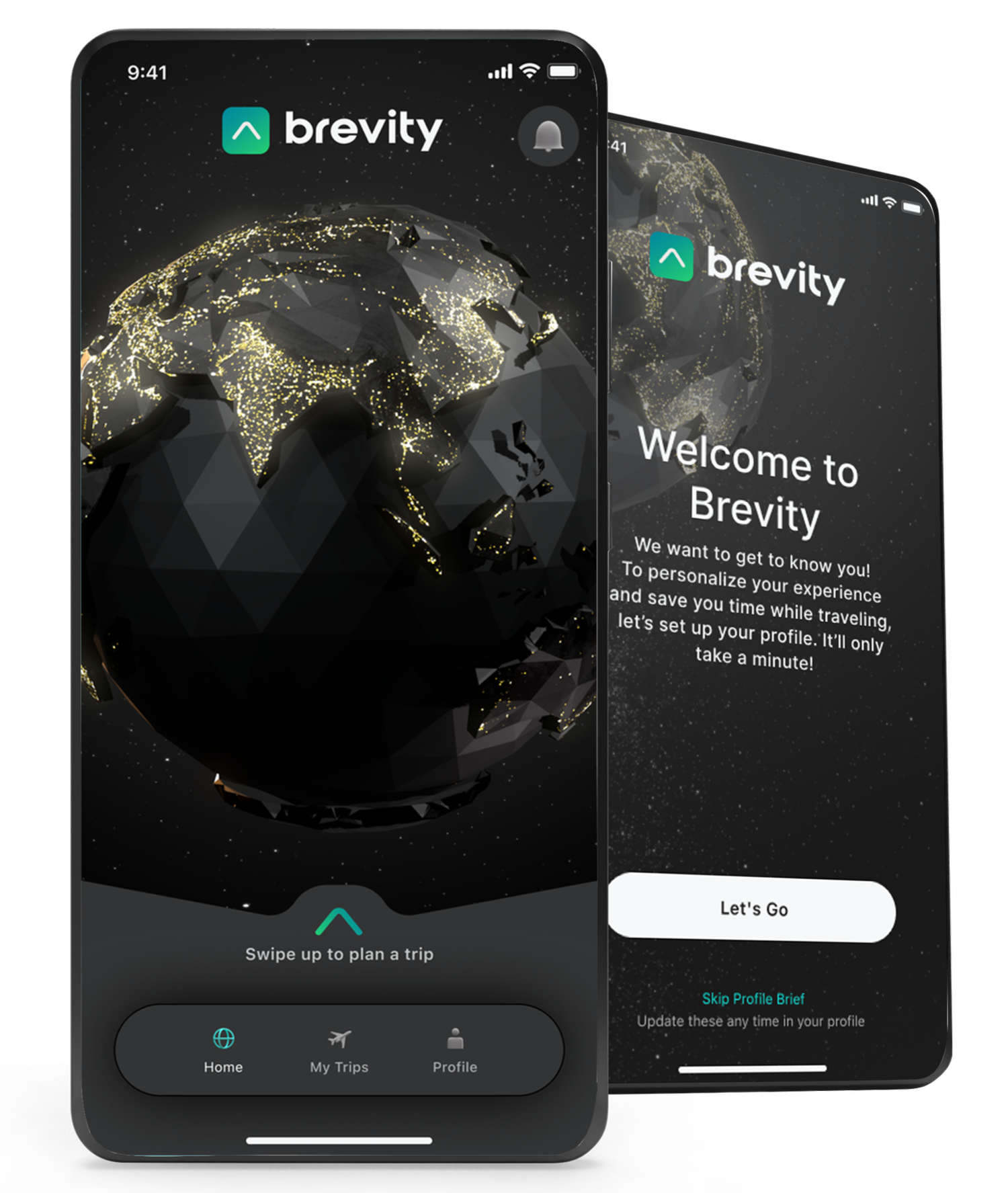
The central design problem was balancing curation with control. Travelers needed enough guidance to avoid an overwhelming planning process, while retaining the ability to shape a trip around their preferences.
My work connected the product’s information architecture, data flow, and visual experience so that inspiration could lead naturally into the next planning decision.
My Role
Product Designer
Product and interaction design, UX architecture, planning data flows, and client collaboration. I translated the planning experience into mobile journeys and a visual direction appropriate to the service.
Platforms
iOS
Android
The Challenge
A premium travel experience needed to do more than look polished. It had to help people make complex choices with confidence.
Reduce decision burden: present a useful starting point without asking users to configure every detail.
Preserve control: make preferences and adjustments accessible at the moment they matter.
Build confidence: connect compelling destination content with a clear planning and booking path.
These priorities shaped both the interaction model and the visual hierarchy.
Research & Design Direction
Interviews, competitive review, and prototype feedback informed the planning journey. The focus was understanding how travelers moved from an idea to a decision, where fragmented tools added work, and how much customization felt useful.
I used those insights to organize the experience around curated discovery, clear preferences, and a visible next step. Prototype feedback helped refine the balance between rich destination content and practical planning controls.

Key Design Decisions
Start with a useful plan. Early customization placed too many choices in front of the traveler. The direction shifted toward defaults with focused opportunities to adjust details.
Use visual richness purposefully. A stark interface did not communicate the quality of the experience. I balanced destination imagery and refined typography with clear hierarchy and actions.
Make personalization tangible. Preferences needed to shape what users saw and remain understandable within the journey. I focused on the experience of reviewing and refining suggestions, rather than adding more configuration.
Design Outcome
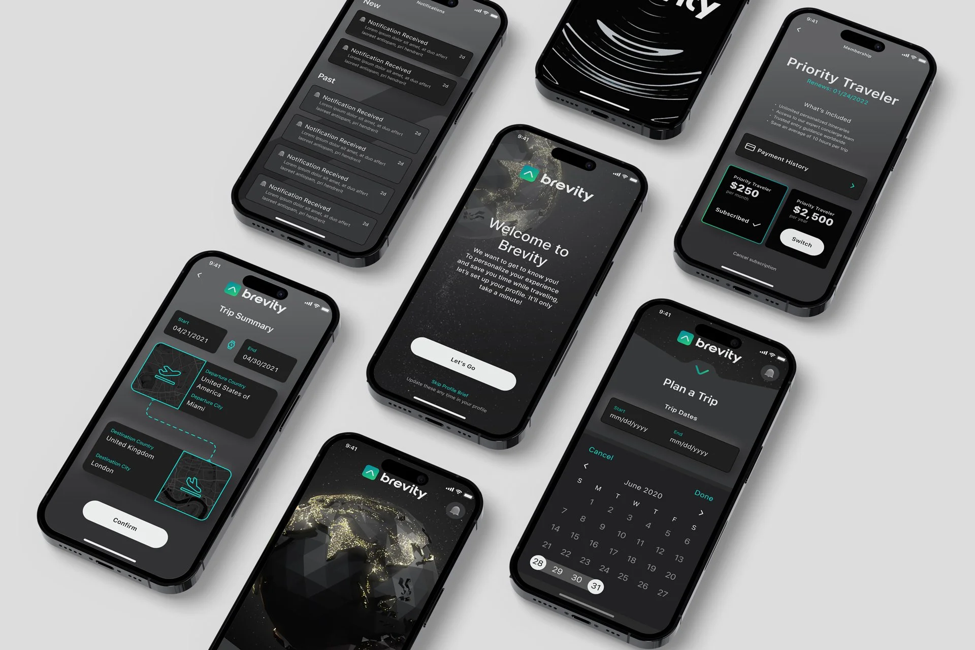
The resulting design brought curated discovery, preference setting, and trip planning into a connected mobile experience. The work established a clear visual direction and an interaction model that balanced guidance with user control.
The screens shown here illustrate how a complex service can be organized into approachable decisions while maintaining the quality expected from a premium travel product.
What this work demonstrates
Premium experiences succeed when visual craft and task clarity reinforce each other. The design needed to make travel feel compelling while making the next decision easier.
This work demonstrates my ability to connect a service proposition to information architecture, mobile interactions, and a cohesive visual experience, from the initial planning model through detailed screens.
Awards & Recognition
W3 Awards 2022
Gold: Business for Mobile
Gold: Travel for Mobile
Gold: Best Visual Design Aesthetic for Mobile
Silver: Professional Services for Mobile
Silver: Best User Experience for Mobile
Silver: Best User Interface for Mobile